

You spent ten minutes getting the text on your video just right. A big bold line across the bottom: "3 Mistakes That Ruin A Paint Job." On TikTok it looked fine. On YouTube Shorts the channel name sat right on top of it. On Reels the caption covered the last word. On Facebook the like and share buttons sliced through the middle of the second line.
Same video, same text, four different screens fighting over the same space. Most people never check, so most people never know that the most important words in their video are hidden on half the platforms they post to.
Every App Puts Its Buttons Somewhere Different
Vertical video apps all look alike at a glance, but the layouts are not the same.
TikTok stacks the like, comment, save, and share buttons down the right side, puts your username and caption across the bottom, and puts the For You and Following tabs across the top. Instagram Reels has a similar column on the right, but the caption and audio info sit in a slightly different spot, and the caption expands when someone taps it. YouTube Shorts has its own button column, plus the title, channel name, and subscribe button along the bottom. Facebook Reels layers its own buttons and text on top in yet another arrangement.
On top of all that, the bottom edge of each screen has a progress bar, a comment box, or a navigation bar, depending on the app and the phone.
If your text sits near any edge, at least one platform is going to cover it.

Hidden Text Kills The Hook
On a lot of short videos, the text on screen is the hook. It is the reason someone stops scrolling. Most people watch with the sound off, so the first line of text has to do the work your voice would normally do.
When half of that line is behind a button, the hook does not land. "3 Mistakes That Ruin A" is not a reason to stop. The viewer is gone before the second line, and the platform reads that quick swipe as a sign the video is not worth showing to anyone else.
So you end up with a video that does well on one app and dies on another, and you blame the audience. The audience never saw the hook.
Keep Your Words In The Middle Of The Screen
The fix is simple once you know it. Treat the edges of the frame as off limits for anything that matters.
Keep text out of roughly the bottom fifth of the screen, where captions, titles, and usernames live. Keep it away from the right edge, where every app puts its button column. Leave some room at the very top, where TikTok puts its tabs and some phones put the status bar. What is left is a box in the center of the frame, a little above the middle. That is the safe zone, and it is safe on every platform at once.
Inside that box, keep lines short. Two or three words per line reads faster than one long line, and it is much less likely to run into anything.
Faces And Products Need The Same Room
It is not just text. If you are pointing at something on the screen, holding a product up, or showing a before and after, the important part of the shot needs to be in that same center box.
A detailer showing the swirl marks on a hood, a baker showing the inside of a cut cake, a roofer pointing to a cracked shingle. If that detail is down in the bottom corner of the frame, a caption or a button is going to sit right on it on at least one app.
When you film, frame your subject a little higher and a little more to the left than feels natural. It will look slightly off on your phone's camera screen and perfectly placed once an app puts its buttons on top.
Your Cover Image Gets Cropped Too
There is a second place this goes wrong: the thumbnail on your profile.
Instagram shows reels on your profile grid in a taller crop than the old square, but still not the full vertical frame. YouTube shows Shorts on your channel in its own crop. TikTok shows the full frame but small, with the view count stamped in the corner. Facebook trims it differently again.
If your cover has a title at the very top or bottom, some of those grids will chop it off. Put cover text in the middle of the frame too, and the profile looks clean everywhere.
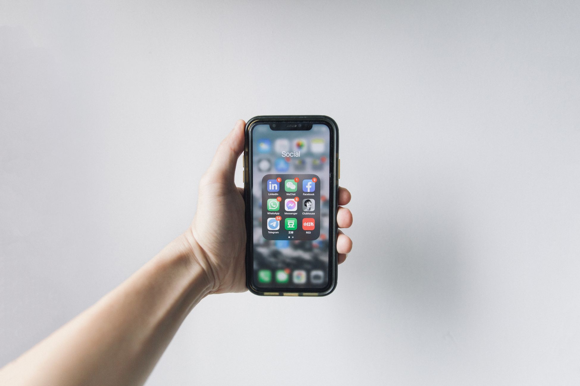
Do It Once At The Source
You do not need seven different versions of every video. You need one version that is built to survive seven layouts.
That means the editing step is where the work happens. Place text in the safe zone, frame the subject higher, keep lines short, and the same file looks right on every platform it goes to. Then distribution is just distribution. Nobody has to edit anything again for each app, and nothing important gets buried.
This is a big part of why cross posting gets a bad reputation. People export a video built for one app, push it everywhere, and blame the other platforms when it underperforms. The other platforms were showing a version of the video with its best words covered up.
Captions Count As Text Too
If you add auto captions, the same rule applies. Most caption tools drop the words near the bottom of the frame by default, which is exactly where every app puts its own caption and username. Drag them up into the safe zone before you export.
Burned in captions that sit too low end up stacked under the platform's caption, and the viewer gets two blocks of text fighting each other while neither one is readable.
Leave Room When You Film, Not Just When You Edit
A lot of this gets decided before you ever open an editing app. If you film with the subject filling the entire frame edge to edge, there is nowhere safe to put text without covering the thing you are showing.
Give yourself some breathing room. Step back a little. Leave empty space above or beside the subject where words can go later. A wall, a sky, a countertop, anything plain works. It feels like wasted space on your camera screen, but it is exactly where your hook will sit once the video is on seven apps at once, each with its own buttons stacked over the edges. Shooting a little wider also gives you room to crop later if a platform wants a slightly different frame.
Test It On Your Own Phone
Pick your last five videos and open each one on every platform where you posted it. Do not look at it in your camera roll or editing app. Look at it inside the feed, the way a stranger would.
Write down every place where a button, caption, title, or username covers something important. If the same problem shows up on more than one video, you have found a habit, not a fluke. Fix it in the edit going forward, and every video you post after that gets a fair shot on every app.
